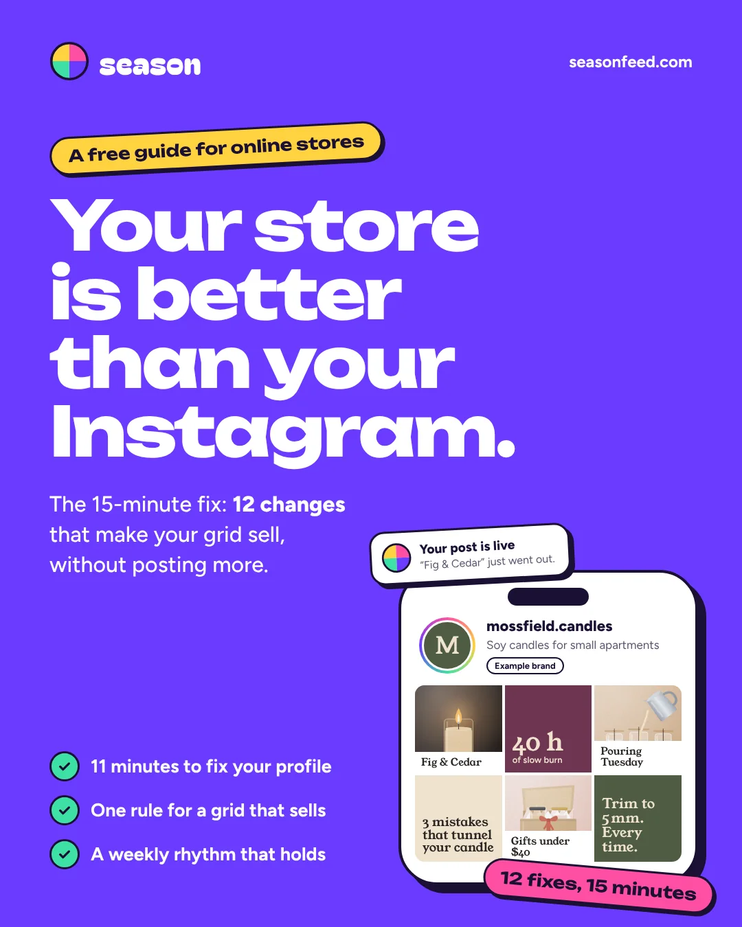
Your store is better than your Instagram.
The 15-minute grid fix: 12 changes that make your grid sell, without posting more. Nine you set up once. Three you keep, in 15 minutes a week.
- No email needed
- PDF, 3 MB
- Made for online stores
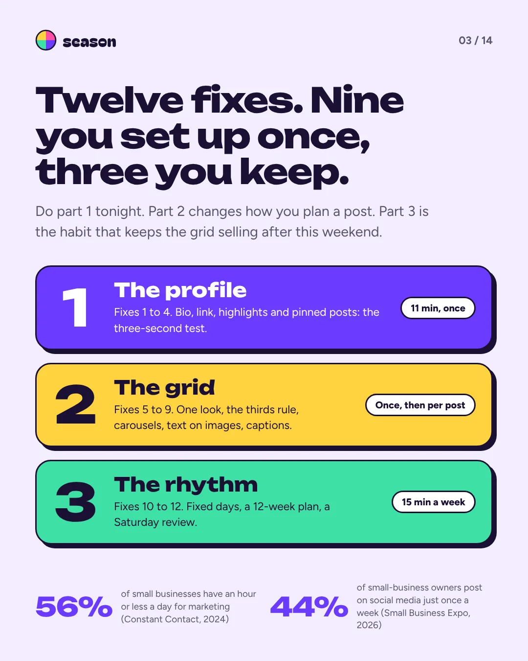
Twelve fixes. Nine you set up once, three you keep.
Do part 1 tonight. Part 2 changes how you plan a post. Part 3 is the habit that keeps the grid selling after this weekend.
The profile
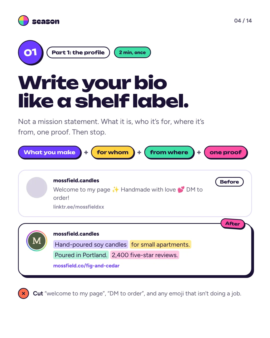
11 minutes, onceFix 1: Write your bio like a shelf label.
What you make, for whom, from where, and one proof. Then stop. Cut “welcome to my page”, “DM to order” and any emoji that isn’t doing a job.
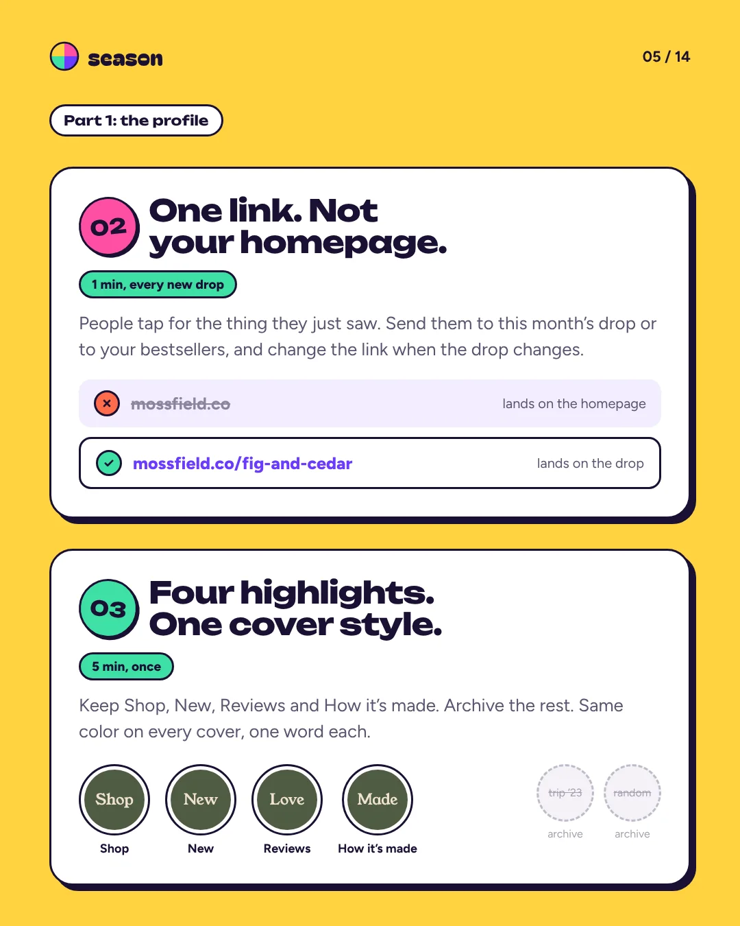
Fix 2: One link. Not your homepage.
People tap for the thing they just saw. Send them to this month’s drop or to your bestsellers, and change the link when the drop changes.
Fix 3: Four highlights. One cover style.
Keep Shop, New, Reviews and How it’s made, and archive the rest. Same color on every cover, one word each.
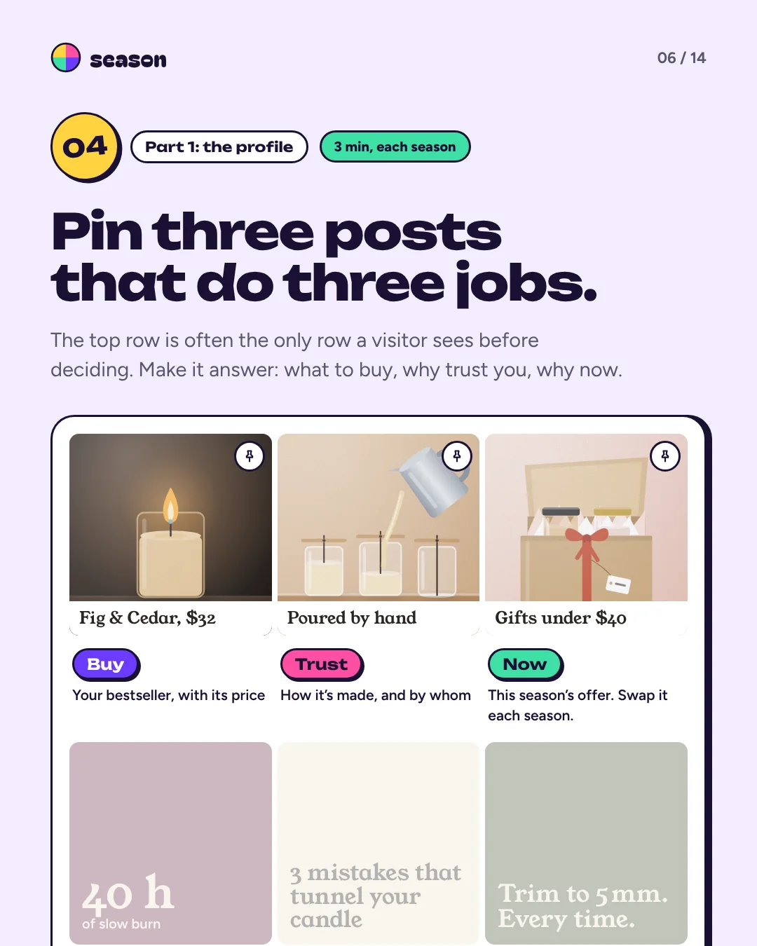
Fix 4: Pin three posts that do three jobs.
The top row is often the only one a visitor sees. Pin what to buy (your bestseller, with its price), why trust you (how it’s made, and by whom) and why now (this season’s offer, swapped each season).
The grid
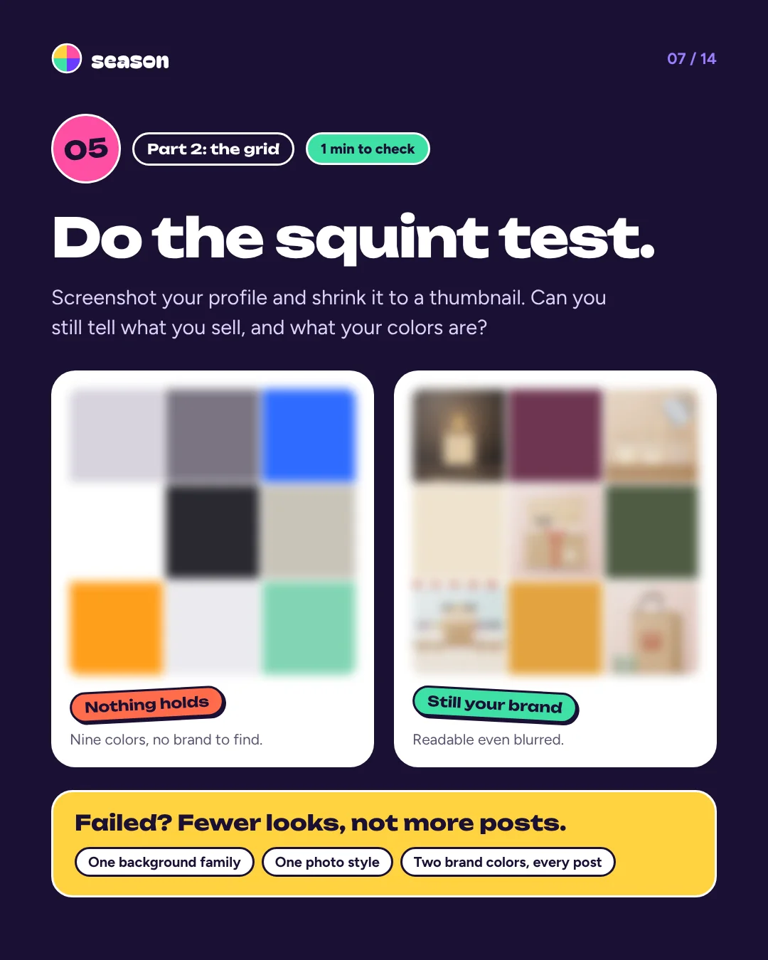
Once, then per postFix 5: Do the squint test.
Screenshot your profile and shrink it to a thumbnail. If you can’t tell what you sell or what your colors are, use fewer looks, not more posts: one background family, one photo style, two brand colors.
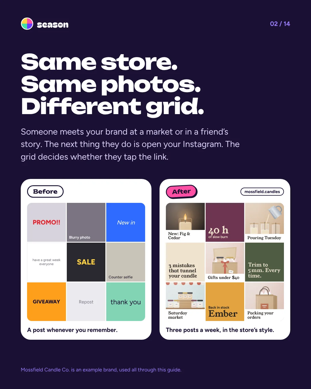
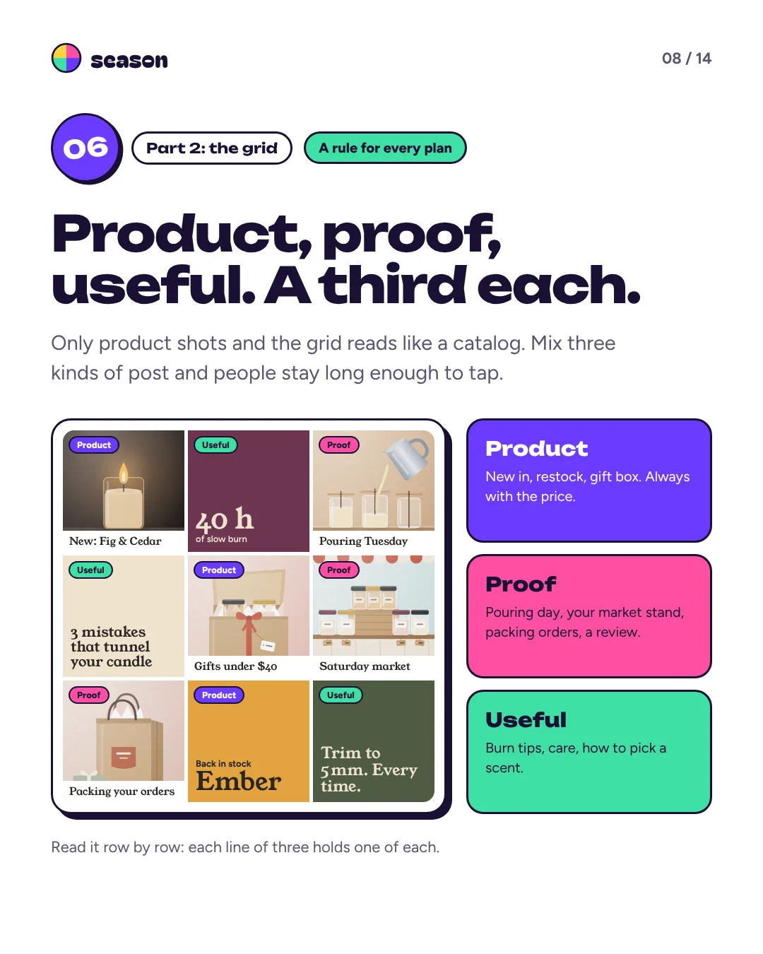
Fix 6: Product, proof, useful. A third each.
Product: new in, restocks, gift boxes, always with the price. Proof: pouring day, your market stand, packing orders, a review. Useful: tips, care, how to choose. Each row of three holds one of each.
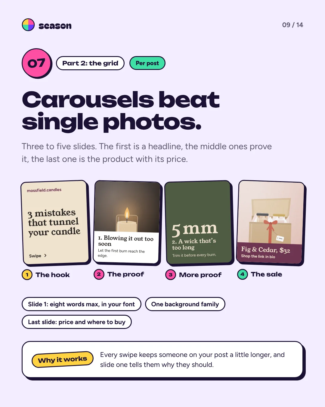
Fix 7: Carousels beat single photos.
Three to five slides. The first is a headline of eight words at most, the middle ones prove it, the last one is the product with its price and where to buy it.
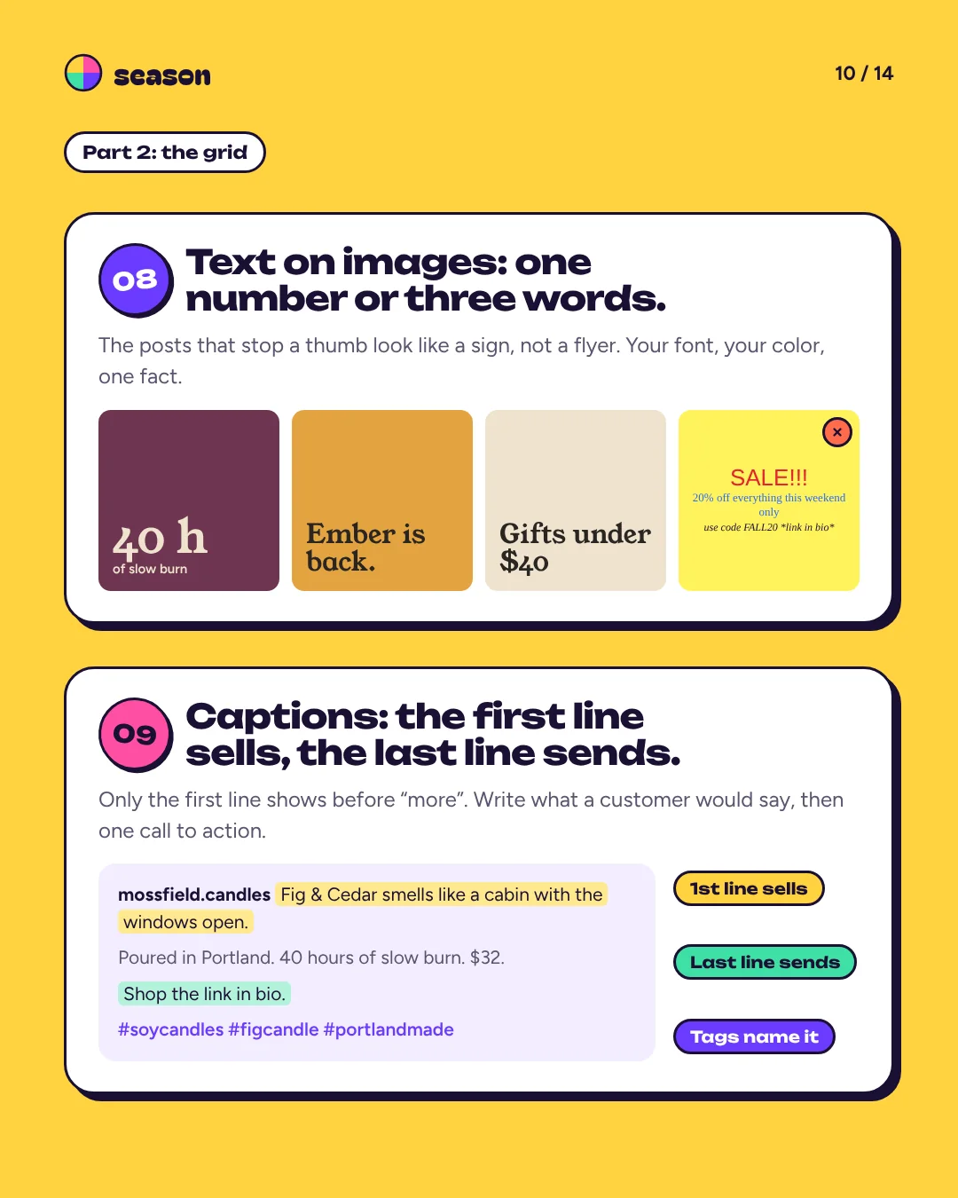
Fix 8: Text on images: one number or three words.
The posts that stop a thumb look like a sign, not a flyer. Your font, your color, one fact.
Fix 9: Captions: the first line sells, the last line sends.
Only the first line shows before “more”. Write what a customer would say, then end with one call to action.
The rhythm
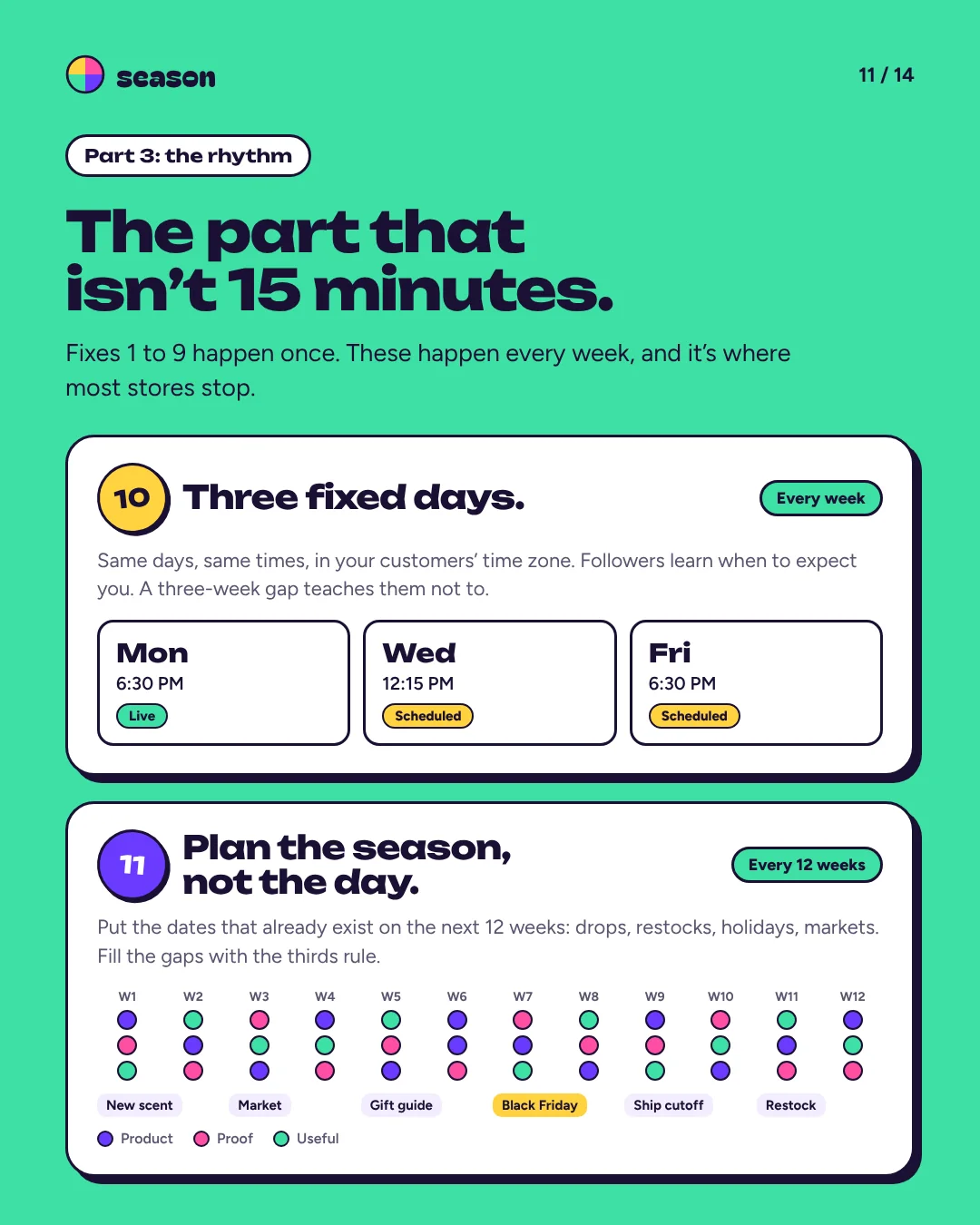
15 minutes a weekFix 10: Three fixed days.
Same days, same times, in your customers’ time zone. Followers learn when to expect you; a three-week gap teaches them not to.
Fix 11: Plan the season, not the day.
Put the dates that already exist on the next 12 weeks: drops, restocks, holidays, markets. Fill the gaps with the thirds rule.
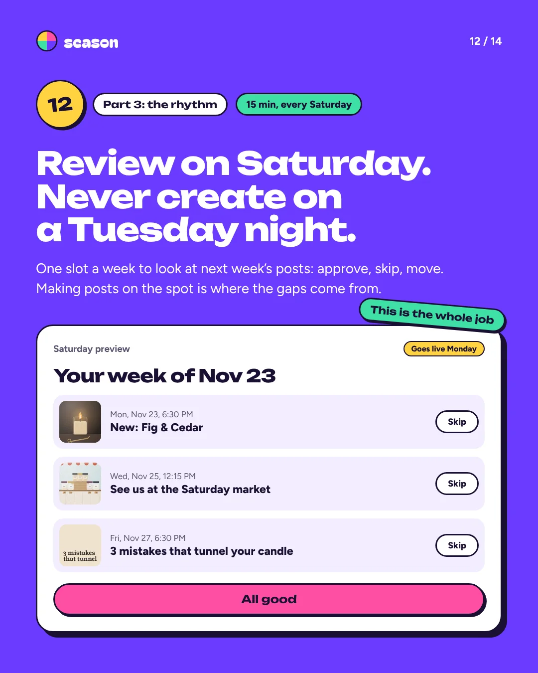
Fix 12: Review on Saturday. Never create on a Tuesday night.
One 15-minute slot a week to look at next week’s posts: approve, skip, move. Making posts on the spot is where the gaps come from.
Flip through the guide.
All 14 pages, as they are in the PDF, with Mossfield Candle Co., an example brand. The scorecard on page 13 is made to print.
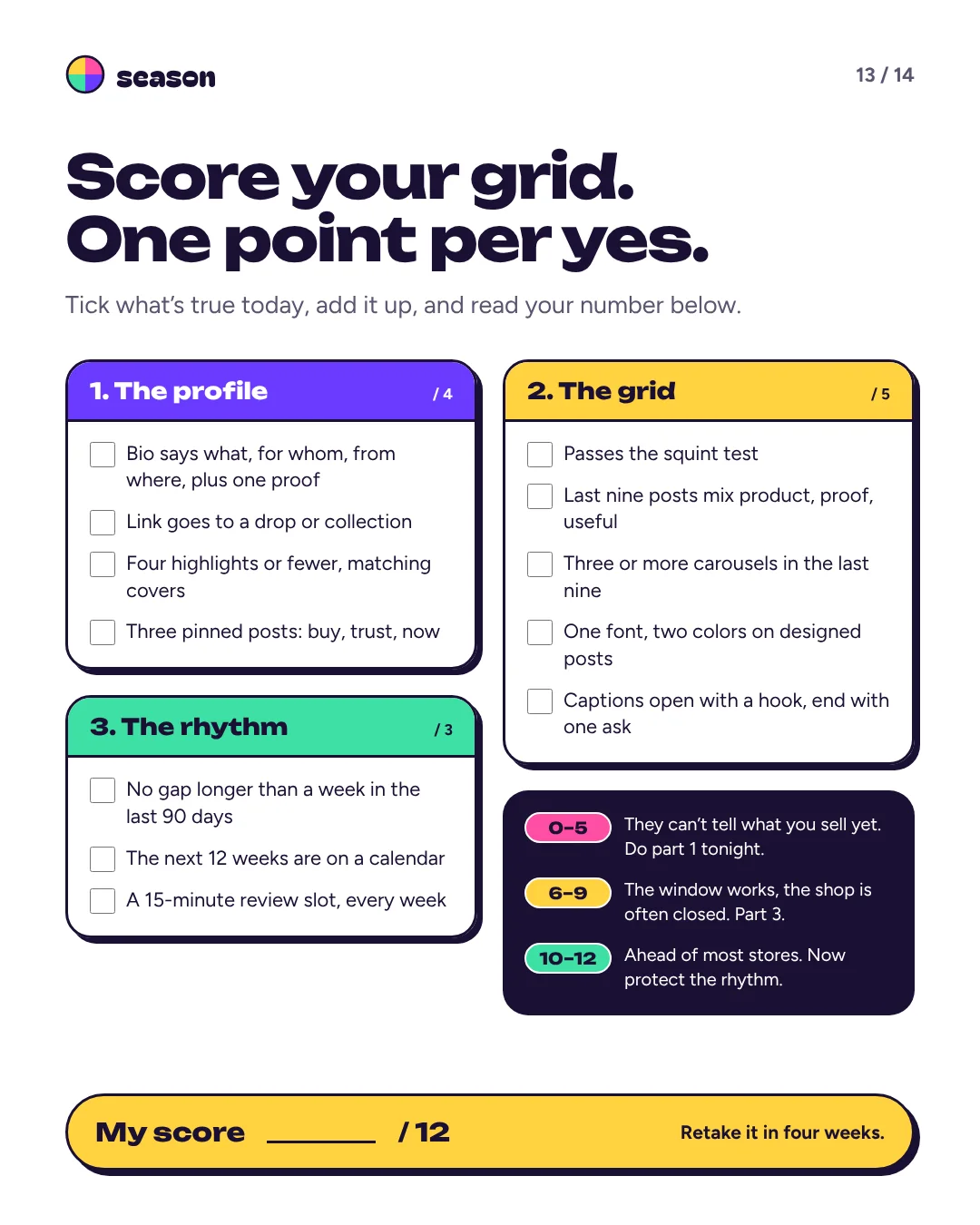
14 pages, 3 MB. No email needed.
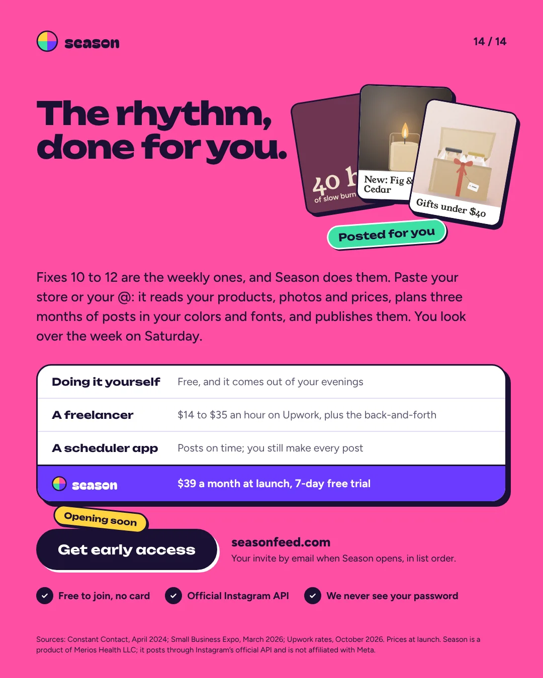
The rhythm, done for you.
Fixes 10 to 12 are the weekly ones, and Season does them: three months of posts in your colors and fonts, published for you, and a look at the week every Saturday. It opens soon: get in first.
- Free to join, no card
- Early access members get in first
- We never see your password